Wedding Suite
I recently got married! While I can’t bake a cake, I can make pretty pictures. So, to save money, and give me practice, I designed the wedding invite, a guest “poster”, and a background sign. Oh. And some stickers. And then I decided to make a custom bar menu.
The Invite
Before I began, I asked my fian…wife… what vibe she wanted. If she could describe the invite in one word, what would it be? She decided on “elegant”. So I started by doing an image search for wedding invites to get ideas. It’s surprising how many are simply templates. Most are just the same few designs, with different people’s names. We didn’t have any wedding photos, because, you know, the wedding hadn’t happened yet. That meant I needed some other sort of image. My wife loves flowers and the color red. So I started there. My first ideas were terrible. I knew it immediately.
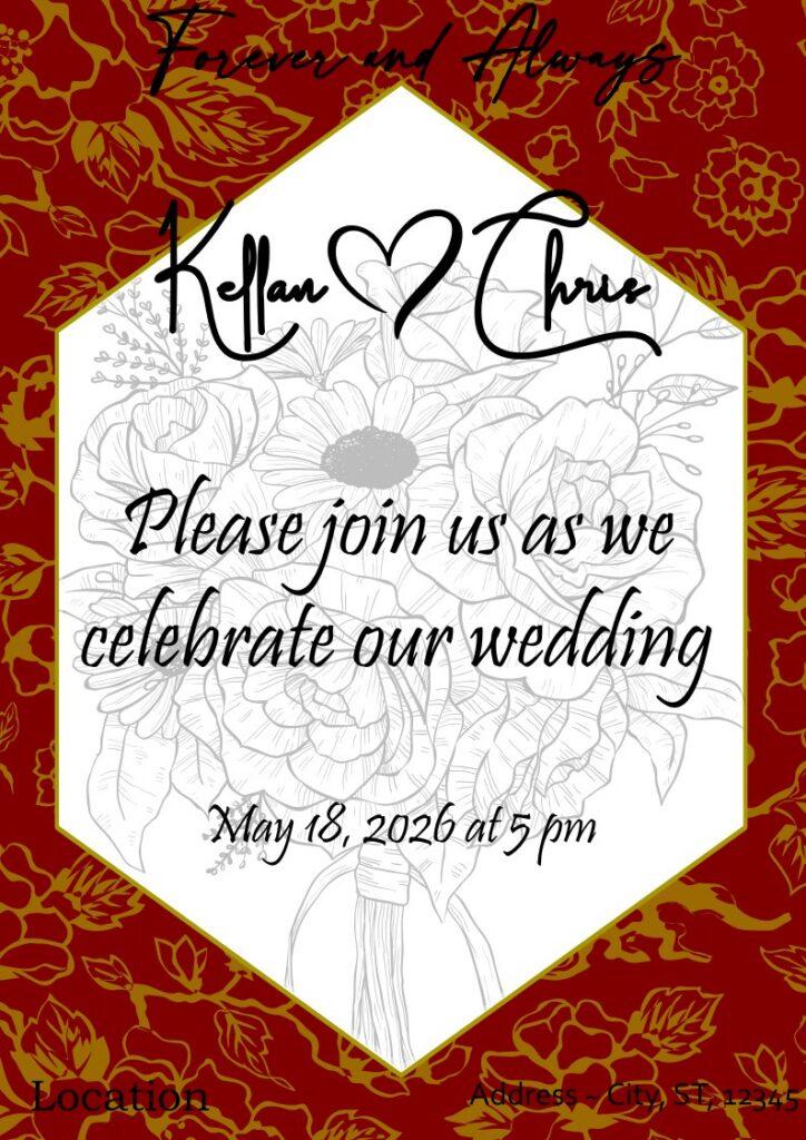
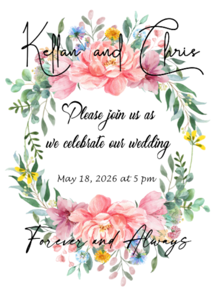
The first version was not at all good. The red and gold was supposed to be “regal”, but came off as an eye straining battle between mustard and ketchup. And they both were losing.
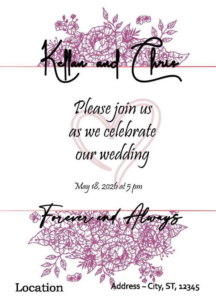
I liked version 2, but it was kind of simplistic. It wasn’t very colorful. I like the layout, and maybe I’ll use it for something else some day.
Version 3 was getting a lot closer to what we wanted. It was colorful. It had flowers. It was easy to read.

I played with the fonts, which I really enjoy doing. I’m also proud of the hexagon outline “fade”. I did the same technique with the rectangle around the location. It’s just a stroke, but instead of one color, it’s a gradient with 4 points, fading from pink to transparent and transparent to pink. I also like the semi transparent white where it overlaps the flowers. We also added important information, as if there was a “back” to the invite, even though we just sent it as a pdf to everyone.
The stock photos were from PhuongLucky. The fonts include Dalton White (for the names), Bithea (for the “Please join us…” and date), Modernline (Forever and Always), and good ol’ Verdana (for the content).
The Guest Poster
Instead of a guestbook, we opted for a poster. Everyone signed it, and then we’ll frame it and hang it up on the wall. I threw around a few ideas, but the only one I really pursued was this one. It features the script from our wedding as the background, with a silhouette from our engagement photos in the foreground, surrounded by the Seattle skyline on one side and a forest on the other. I also added “Forever <3 Always” at the bottom, because that sort of became our wedding’s tagline.

The font was still Modernline for the tagline, and Blistany for the wedding script.
The vectors were from Marco Livolsi and Tatyana Pavliuk (with a ton of edits to simplify it).
The Photo Background
Next I was informed that we’d need something so our guests could take a photo in front of it so people knew where they were. Apparently this is a thing people do. We also used it as a welcome sign so our guests knew they were in the right place. For inspiration, I started with the invite, and moved things around. I played with the fonts a little.

Something was off. I couldn’t put my fingers on it. So I kept playing with it. Moving things. Taking things away. Adding things. Playing with the fonts. Finally I settled on this.

It was perfect. Simple. Elegant. It worked as a welcome sign and a background for photos. It matched our theme. And OMG I love the font for our names. Swirls and swirls and swirls. The capital letters in our names are Magnolia. The rest of our names are in Scriptina. “Welcome” is Modernline. “to the Wedding of” and the “date and time” are Blistany. The flowers are the same from the invite. It looked amazing on the foam board.
Stickers
For the sake of why not, I also decided to make some stickers to put on things like the wedding favor gift bags, or the to go food containers. The font for our names is Magistica. The “thank you” is in Dalton White.

Bar Menus
At the last minute, I decided to make some bar menus. I also made matching food cards, but the venue ended up not using them.
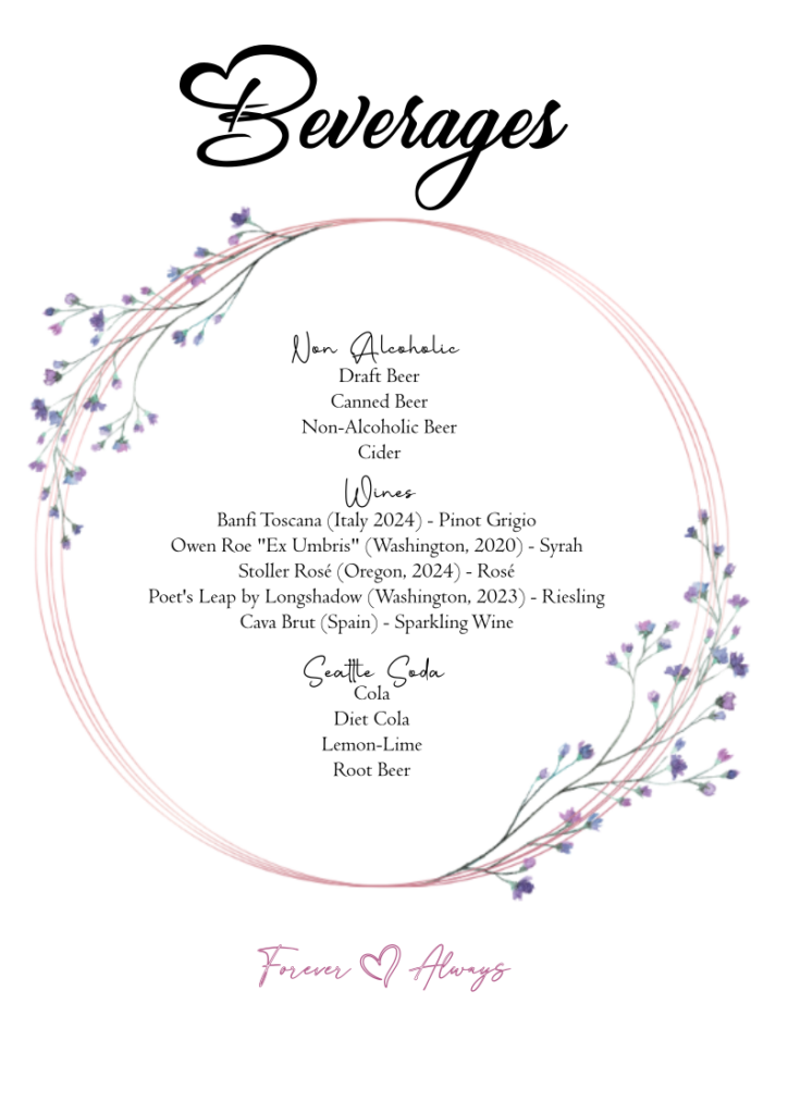
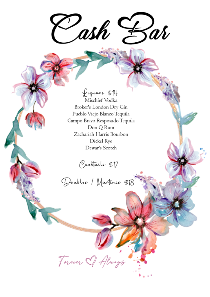
The font for the headers is Hugh Is Life. I love the little hearts in the capital letters. The categories were in Bithea. The drinks were in Centaur, which comes with InkScape. The images were also from PhuongLucky.
I think they all turned out really well. They looked professional. There was a clear theme that tied them all together. I’m quite proud of myself. Finally my art degree could be put to real world use.
